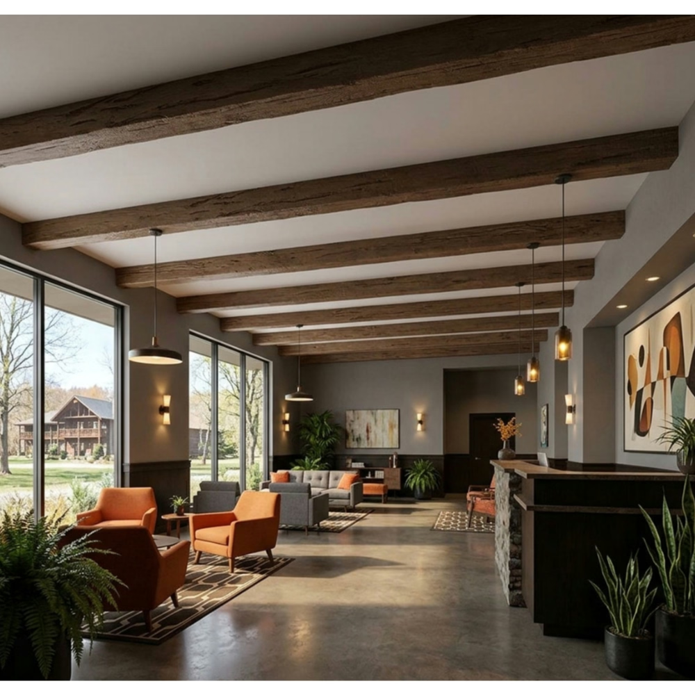
The modern farmhouse renovation featured beautiful white oak floors throughout—bleached, wire-brushed, and sealed to pale honey tones emphasizing grain texture. The client wanted ceiling beams creating architectural interest but couldn't decide between matching light oak continuing the pale aesthetic or contrasting dark walnut creating dramatic focal points. We developed mockups showing both approaches: light oak beams created serene cohesive spaces feeling larger and more unified, while dark walnut beams provided striking contrast creating visual weight and spatial definition but making rooms feel smaller. The client ultimately chose light oak for the open-plan living areas maintaining spatial flow, with dark walnut accent beams in the study creating intimate character. Understanding how wood tone choices affect spatial perception and design character enabled informed decisions optimizing each approach's strengths for specific contexts.
White oak versus walnut color matching represents fundamental design decision affecting spatial character, material coordination, and overall aesthetic. These wood tones—light versus dark, cool versus warm, subtle versus bold—create different design opportunities and challenges. Understanding their spatial effects, coordination strategies, and contemporary application guides color selections supporting design intentions rather than arbitrary preference.
Understanding Wood Tone Characteristics
White oak color profiles ranging from pale cream to light honey feature subtle grain patterns with characteristic ray fleck figure. Contemporary treatments often emphasize light tones through bleaching, liming, or natural clear finishes. White oak's cool undertones suit modern aesthetics favoring neutral palettes. The light value creates airy spatial character while texture interest prevents blandness.
Walnut color characteristics from medium chocolate to deep espresso provide rich warmth through prominent grain patterns and color depth. Natural walnut exhibits purple-brown undertones when freshly cut, mellowing to warm brown with age and UV exposure. Walnut's inherent drama and luxury associations make it popular for statement applications despite darker values that can feel heavy in excess.
Color temperature differences between cool-toned white oak and warm-toned walnut affect coordination with other materials and spatial perception. Oak's cooler tones harmonize with grays, whites, and contemporary neutrals. Walnut's warmth complements earth tones, natural stone, and traditional palettes. Understanding these temperature relationships guides successful material coordination.
Visual weight disparity where dark walnut appears heavier than light oak affects spatial balance. Walnut beams create stronger visual presence per linear foot than oak equivalents. This weight difference means walnut demands more careful application—what works scaled appropriately in oak might overwhelm when translated to walnut without adjustment.
Light reflectance values differ dramatically—white oak reflects 40-55% of light while dark walnut reflects 15-25%. This reflectance difference affects overall room brightness. Light oak brightens spaces through reflection while walnut absorbs light potentially darkening rooms. In naturally dim spaces, oak proves more practical than walnut requiring supplementary lighting maintaining brightness.
Spatial Effects and Perception
Light oak spatial expansion through high reflectance and receding visual character makes spaces feel larger and more open. Light values advance less than dark values, creating perception of greater volume. In smaller rooms or low-ceiling spaces, light oak maintains openness that dark walnut would compromise. This expansion effect proves particularly valuable in contemporary design emphasizing spaciousness.
Walnut spatial definition using visual weight and contrast creates stronger architectural presence defining spaces within open plans. Dark beams against light ceilings draw attention, creating focal points and spatial boundaries. In large open spaces potentially feeling undefined, walnut beams provide structure and organization that light oak might not achieve as effectively.
Ceiling height perception varies with color—light colors make ceilings feel higher while dark colors bring them down psychologically. White oak maintains or enhances ceiling height perception while walnut creates more intimate overhead planes. Understanding these perceptual effects guides appropriate application based on existing ceiling heights and desired spatial character.
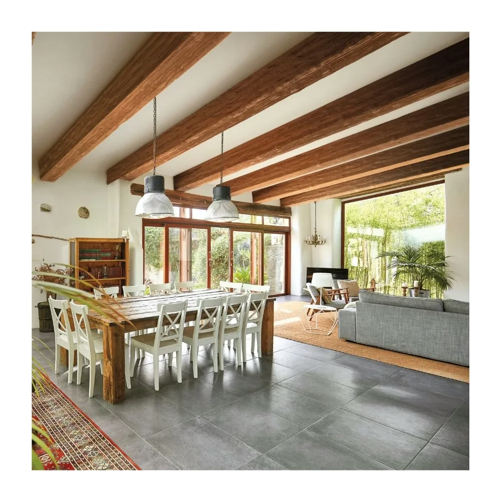
Color contrast management between beam colors and ceiling finishes affects visual dynamics. High contrast—dark walnut on white ceilings—creates drama and definition. Low contrast—light oak on off-white ceilings—emphasizes texture over color creating subtle sophistication. Contemporary design employs both strategies for different effects requiring intentional decision-making.

Material Coordination Strategies
Flooring relationships when oak or walnut floors exist create coordination opportunities and constraints. Matching beam colors to flooring creates vertical-horizontal continuity and cohesive material stories. Contrasting beam and floor colors provides variety but requires careful coordination preventing discord. Contemporary design sometimes intentionally mixes wood tones—perhaps light oak floors with walnut beams—creating dynamic tension when skillfully executed.
Cabinetry coordination in kitchen and bath areas where substantial wood surfaces exist requires harmonious beam color selection. Matching beam colors to cabinetry unifies spaces while contrasting creates zoned differentiation. All-light or all-dark wood strategies prove safest while mixed approaches demand sophisticated color sense preventing visual confusion.
Furniture integration where wood furniture pieces interact with architectural wood elements creates complexity. If substantial wood furniture exists, beam colors should either match maintaining cohesive material palette or contrast sufficiently that differences appear intentional rather than failed matching attempts. Muddy mid-range differences prove most problematic.
Stone and masonry combinations coordinate differently with oak versus walnut. Light oak complements white marble, light limestone, and pale stone creating fresh contemporary character. Walnut suits warmer stone—travertine, sandstone, slate—creating rich traditional or transitional character. Understanding these affinities guides successful material combinations.
Metal finish coordination varies with wood tones. Light oak pairs naturally with cool metals—stainless steel, chrome, nickel—reinforcing contemporary coolness. Walnut complements warm metals—bronze, brass, copper—enhancing traditional richness. Mixed metal approaches can work but require careful control preventing visual chaos.
Contemporary Design Applications
Scandinavian minimalism favoring light, airy spaces with natural material warmth makes white oak natural choice. Light wood tones prove fundamental to Scandinavian aesthetic, creating brightness essential to northern light-deprived environments. White oak beams in Scandinavian-inspired interiors maintain design authenticity while providing architectural interest without heaviness.
Modern organic design emphasizing natural materials with contemporary clean lines accommodates both oak and walnut depending on desired character. Light oak creates softer organic modernism while walnut provides bold material statements. Both work within modern organic frameworks—choice depends on specific spatial character and lighting conditions.
Industrial contemporary combining raw materials—concrete, steel, brick—works with both wood tones differently. Light oak softens industrial hardness creating balanced warmth. Dark walnut reinforces industrial drama through material richness and contrast. Understanding desired balance between industrial edge and natural warmth guides wood tone selection.
Transitional design bridging traditional and contemporary benefits from either tone depending on directional emphasis. Leaning contemporary, choose white oak; emphasizing traditional, select walnut. Transitional design's flexibility accommodates both but requires clear vision about which direction dominates preventing uncommitted middle-ground that satisfies neither aesthetic.
Lighting Considerations
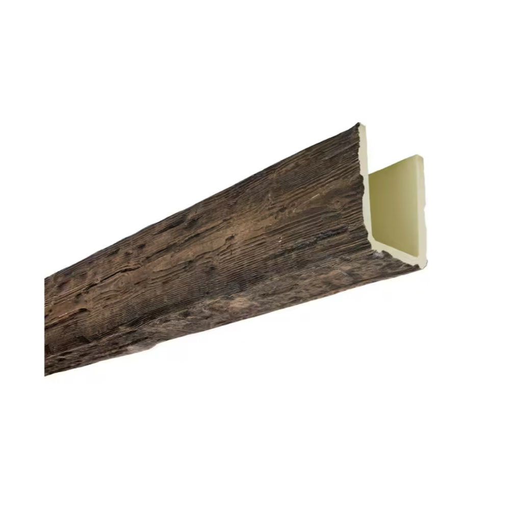
Natural light abundance affects wood tone practicality. Rooms flooded with natural light accommodate dark walnut without becoming gloomy. Limited natural light makes white oak prudent choice maintaining brightness. South-facing rooms with intense sunlight might benefit from walnut's light absorption preventing excessive brightness, while north-facing rooms need oak's reflectance compensating for limited natural light.
Artificial lighting design must account for wood tone choices. Dark walnut requires more artificial lighting maintaining comfortable illumination—perhaps 30-40% more than equivalent spaces with light oak. Lighting budgets and energy consumption differ based on wood tone choices. Understanding these practical implications prevents underlit dark spaces or lighting system inadequacy.
Color temperature coordination between lighting and wood tones affects appearance. Warm LED (2700-3000K) enhances walnut's richness but might make white oak appear yellow. Cooler LED (3500-4000K) suits white oak's cool tones but can make walnut appear dull. Lighting color temperature should coordinate with dominant wood tones maintaining intended color character.
Trend Considerations and Longevity
Current trend status shows white oak surging in contemporary design replacing gray-washed or dark espresso dominant in 2010s. Walnut maintains steady popularity in traditional and transitional design but sees reduced contemporary application. Following trends risks obsolescence while ignoring them creates dated appearance. Understanding trend context helps making informed decisions about whether trending choices suit long-term intentions.
Classic versus trendy assessment distinguishes enduring design choices from fashion statements. Natural wood tones—both light and dark—have centuries of precedent suggesting longevity compared to gray-washed or painted trends with shorter histories. Authentic wood tones in straightforward applications prove safer bets for long-term satisfaction than heavily processed trendy finishes.
Design lifecycle planning for spaces with different renovation horizons affects acceptable trend risk. If renovating every 5-7 years, following current trends proves reasonable. For 15-20 year timelines, classic choices warrant emphasis. Understanding intended design lifecycle guides appropriate trend engagement versus timeless conservatism.
Mixing Oak and Walnut Successfully
Intentional contrast using different wood tones in distinct spaces or applications can create dynamic character when thoughtfully executed. Light oak floors with dark walnut beams creates clear intentional contrast. However, this mixing demands confidence and sophisticated color sense. Unsuccessful mixing appears indecisive or accidental rather than intentionally designed.
Transition strategies when moving from oak-dominant to walnut-dominant spaces require managing wood tone transitions. Clear thresholds—doorways, architectural breaks—allow wood tone changes. Gradual transitions within open spaces prove harder executing successfully. Strategic planning about where wood tones change prevents awkward indeterminate zones.
Proportion and balance when mixing wood tones typically benefits from making one dominant and another accent rather than equal distribution. Perhaps 70% light oak with 30% walnut accent creates balance. Equal distribution risks visual competition. Establishing clear hierarchy prevents tonal confusion.
Budget Implications
Material cost differences between oak and walnut finishes vary by manufacturer but walnut finishes sometimes command 10-15% premiums due to popularity and perceived luxury. However, polyurethane beam costs more closely related to size and texture than wood tone simulation. Cost differences prove minor compared to flooring or cabinetry where actual wood species affect pricing significantly.
Lighting cost implications from wood tone darkness might prove more significant than material costs. Walnut-heavy interiors requiring 30-40% more artificial lighting for equivalent brightness see ongoing energy costs plus higher initial lighting system investments. Over decades, these costs potentially exceed material premiums for lighter finishes.
Resale considerations vary by market—some buyers prefer light contemporary aesthetics while others favor rich traditional character. Extreme choices in either direction might limit buyer appeal versus middle-ground approaches. However, well-executed designs in either palette attract appropriate buyers. Quality execution matters more than specific color choices for resale value.
Regional and Cultural Preferences
Geographic preferences show coastal and urban markets favoring light contemporary oak while suburban and rural areas show stronger walnut preference. These generalizations have exceptions but suggest market affinities affecting resale considerations. Understanding regional preferences helps gauging whether choices align with or counter local aesthetics.
Cultural associations differ—Scandinavian and Japanese design traditions emphasize light woods while English and American traditional design favors dark woods. Contemporary global design borrows from multiple traditions, but understanding cultural wood tone associations helps making choices supporting intended design narratives.
Maintenance and Aging
Dust and dirt visibility differs—light oak shows dust less than dark walnut where particle contrast makes cleaning requirements more demanding. Dark finishes require more frequent dusting maintaining appearance. This practical consideration affects long-term satisfaction particularly for high beams difficult accessing for cleaning.
UV effects and color changes over time affect both wood tones—oak tends darkening with UV exposure while walnut sometimes lightens, both moving toward middle tones over decades. Understanding these aging characteristics helps anticipating long-term appearance versus initial installation. However, interior UV exposure proves modest compared to exterior applications—aging occurs over decades rather than years.
Decision Framework
Spatial character priorities determining whether emphasizing openness versus definition guides oak versus walnut selection. If maximizing spatial openness proves paramount, oak wins. If creating defined character spaces matters most, walnut succeeds. Clarifying spatial priorities focuses color decisions.
Lighting realities assessing actual natural and artificial light guides practical choices. Abundant light accommodates either option while limited light makes oak prudent. Honest lighting assessment prevents choices that might theoretically appeal but prove impractical given actual conditions.
Material context considering existing flooring, cabinetry, and furniture guides coordination decisions. Working with established material palettes proves easier than fighting them. If substantial dark wood exists, walnut beams coordinate naturally. Predominantly light spaces suit oak.
Personal preference versus design principles balancing individual taste against design best practices requires self-awareness. Strong personal preferences deserve respect but understanding design principles helps making choices likely creating satisfying long-term results versus fleeting trend following or arbitrary preference.
Professional Color Strategy
White oak versus walnut color matching in contemporary interiors represents fundamental design decision affecting spatial character, material relationships, and aesthetic outcomes. Neither proves universally superior—each creates distinct opportunities and challenges requiring understanding their spatial effects and coordination principles. For designers and homeowners creating contemporary interiors with ceiling beams, systematic analysis of spatial conditions, lighting realities, material context, and design intentions guides wood tone selections optimizing each approach's strengths while avoiding their limitations.
Success demands moving beyond arbitrary preference toward informed decision-making considering how color choices affect actual spatial experience, maintenance realities, and long-term satisfaction. The discipline to analyze systematically rather than choosing impulsively distinguishes sophisticated design from unconsidered decoration.
Technical References
ASTM standards cited in every specification
Test Data
Lab results from internal testing program
Updated 2026
Reviewed against current product specs